Blue Diptych, 1968
acrylic on vinyl screen on cotton
96” x 158” (243.84 cm x 401.32 cm) diptych: two panels with 2" separation
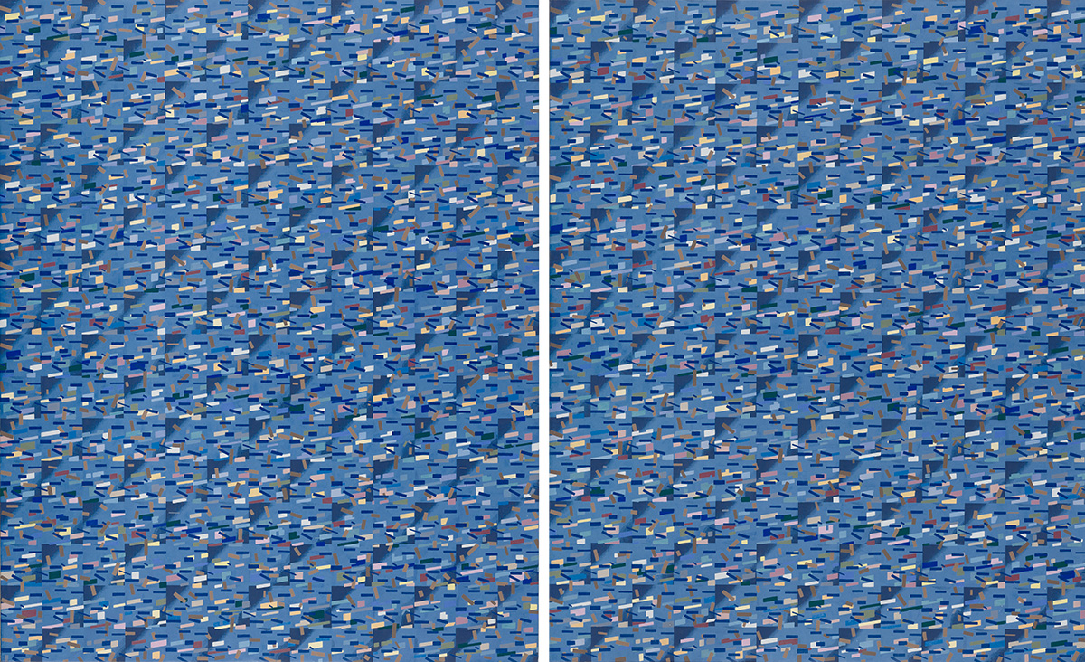
Blue Diptych, 1968. After my beginning paintings of organic and baroque complexities, I began to gradually geometrize elements, seeking a modernist clarity in form and execution. I made over ten works which were extremely labor intensive until one painting consumed a year to complete. I looked to silk screening to print a mapping of elements onto which I would paint differentiation by hand. Blue Diptych was the first of this method and screening or stenciling continued throughout my practice. It is of two panels with a two-inch separation and an obvious visual warpage in each. Compositional balance is achieved by reiteration (two wrongs make a right). It also refers obliquely to serial technique where twelve color tones never repeat by reoccurring in different shape size elements. The inspirational references were Arnold Schoenberg, Milton Babbitt and Edgar Varese. For me, form derived from thinking procedures was of constant intrigue, with its roots in late Mondrian and computer media. I needed a visual parallel to music (a visual field analogous to an audial field). Applying techniques common to music (e.g., variation, graduation, pixilation, density, openness, softness, sharpness and a full color palette) allowed me to consider a more essential way towards painting. As music was deeply communicative yet abstract, I wanted a painting devoid of imagery to achieve something parallel to it.
1 | 2 | 3 | 4 | 5 | 6 | 7 | 8 | 9 | 10 | 11 | 12 | 13 | 14 | Next page